Increase Your Content Value than Website Design
I always believe than when it comes to website development, the lesser and unique, the better. I feel a real content speaks much more than stuffing the website with unrealistic articles that seem unoriginal and really should not be there in first place. And there are valid reasons, why I stand valid to my point. Let’s take a dig how better content can deliver a six pack sales than any other website designing techniques.
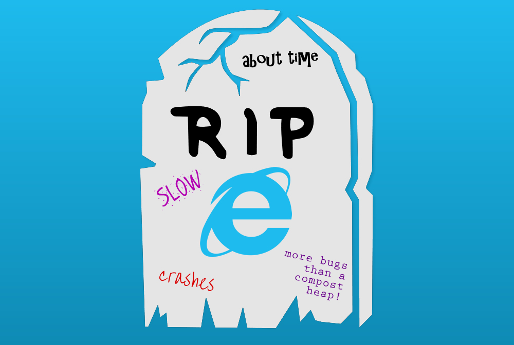
Why Internet Explorer is Extinct?
Let’s face it. People today lack the patience to sit and wait for the entire page to load. This is exactly why “Internet Explorer” is extinct. Consumer’s time matters. If your page is slow to load, a normal human being will actually count you down 4, 5, 6….and moves to the ‘close’ button. The maximum loading time is 10 seconds! Don’t keep them hanging in there! It’s suicide.
What Kills A Customer?
If your page is a drag, it’s time to revamp your website design and content. You don’t always get to blame it on the web browsers. Everyone uses smartphone, tablets these days and majority of the websites are seen on such handy devices leaving only a few to operate desktop and laptop. Hence, it is essential that the pages are mobile friendly (AND desktop friendly, as well) and open quickly.
Apart from that, here are few things that can make you customers take the nearest exit.
- Too much stuffing of keywords
- Clogging the website with undesired animations and graphics (it can weigh down the loading time). Top ecommerce sites use CDN to reduce loading time, but that’s another story.
- Plain and simple website that is not appealing to the user’s eye
- Plagiarized or unoriginal content can impact the google ranking
- Overload of articles (be it product or general content) that does not give consumers what they are looking for. At such instances, infomercial pages, often used by affiliate marketers can work. The reason because, one single article can carry everything a consumer needs to know about the product. Infographic images, proper jQuery are you are good to go.
- Too much linking on a single page also reduces Google Ranking reducing customer impressions.
That being said, ask any website owner and he can vouch that apart from designs and images, the connection a consumer feels with a website is the content that is put up.
A proper website design should orbit around the user’s needs pushing their desire to visit again. It should focus more on the user’s challenges and ability to solve any issues they are facing.
Designs change, the customer remains
As a website owner, it is an in-built craving to get maximum amount of sales and carve a nitch in the global arena. But then many forget the core essence of a website and focus on design requirements such as superhero images, video backgrounds, hamburger menus, endless scrolling and so on. Returning visitors are a challenge and if you are able to surpass this challenge, you are a clear winner.
Nonetheless, very rarely do people ask for a website design and deliver a data that speaks for the visitor’s needs and the ultimate goal of having a website.
Sadly, though many website owners are lured by trending design, peeking up the competitor’s websites and checking out the design elements available. Somewhere during the process, they lose track of website visitors who are looking for their answers in you.
Many website owners choose a design template and are head over heels in love with its graphical presentation and other features it offers. Basically, it’s how the website owner’s emotion that overrides the fact of actually looking for a solution to help the customer.
Tragically, enough once they buy a predesigned theme/template, they have no other option but to force the content, images to fit in the template. Worse is snooping competitor’s website and trying to recreate the design that falls on same line. Result is a complete disappointment leaving the consumer frustrated and sad.
Put Importance to Content First
Many website designers put prime importance to the graphics and then implement the content, call to actions, link building etc. This is an erroneous approach because you are pushing the content to match the website theme whereas, in fact, it should be the other way around.
Next time before finding your competitor’s design intimidating, loving the animation or the template, or actually hiring a graphic designer, make sure you have proper goals and ideas which you will be putting forth across the table.
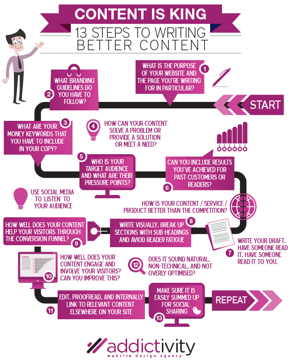
Keep a checklist of the consumer personality, the challenges they are facing, solutions you are planning to offer and the right paths you want these consumers to visit in your website.
Now, I am not saying website designing is not important. In fact, it delivers an aesthetic appeal to your website and gives it a professional look. Nevertheless, it must be triggered at the right time permitting you to deliver the website, its content in the best way possible.
As Jeffrey Zeldman said, “Content precedes design. Design in the absence of content is not design, its decoration.”
The ultimate message and informative content are like amino acids on your body. They are the building blocks for your website without which you will find your website deficient. Deliver a carefully presented and well documented content before jumping on to bold and italic patterns.
Furthermore, the design elements should mesh well and highlight the key message of the content.
Right Content Right Customers
Content just not mean penning down all the items before you even start with the website designs. This can be quite a pain in neck.
When I say writing content, it should focus initially on the core website sections and pages. For instance, if you are writing a page for a newbie website, make sure to look for areas that go well with the customized themes. Of course, there are always exceptions based on the industry, target audience etc.
Few common areas that benefit with primary content strategy are:
- Home page
- About us page
- Main/Individual service pages
- Product pages
- Resource section, categories etc.
- Personas
- Landing page templates
- Blog pages, if any
- Contact us
As a website designer, priorities of the design templates change. While, at times, a handful of customized templates is enough, at other times, a web designer calls for 15-20 themes. It is all about the content, its flow and the call to action.
Delving more on the project calls for even more information on the core elements and how it can be changed based on variable areas in the website.
Content elements that play a vital role before the website design include:
- Headlines, subheading
- Core message
- Paragraph text
- User persona, visitor paths etc.
- Call to action
- Images
- Videos
- Navigation urls
- Social media accounts available
- SEO (Search Engine Optimization)
More knowledge your graphic designer has, more targeted will your design be.
Balancing It All
Just like one of those challenging moments in life, at times, you cannot pick content before web designing. It is one of the instinctive battles that you have to choose.
If you feel it is quite overwhelming then I recommend you start with universal factors such as SEO, navigation links, call to action etc. You can then narrow down by checking the user personalities, visitor paths etc.
Focus more on the known and then create a design starting with the homepage. Build the design from this central point. Of course, at all these times, stay vigilant on your visitor’ requirements, what are they looking for and the solution you are offering.
I understand it can be too much to handle (at times), but then, break the biggest chunks to smaller pieces and then start evaluating for better results.
A Helping Hand
If you are looking for a website redesign or planning to launch new website, increase efficiency of existing website, we are more than willing to help.
But then be prepared for lots of questions that will be coming your way. The more we get to know you and your consumer, better we can assist you to achieve.


